Zero inbox

Whether you like or not, email is going to be with us for a while longer and for a lot of organisations it is their preferred method of communication. Unfortunately, as most of us know, it’s not the most efficient, intuitive or spontaneous platform.

To make things worse, most of us have more than one email account. Usually one for work and one for home, and trying to keep on top of both can be quite a challenge, will often gives us sleepless nights, stressed weekends and is a distraction when we want to relax.

So how can you reach email nirvana and consistently get to zero inbox. Here are some handy tips in no particular order.

Subscriptions

Each time you sign-up through an online system you are automatically consenting to be added to a mailing list. Now there’s nothing wrong with this as it often means you will be sent emails about special offers, news about the organisation or something fun you can attend. Whilst it’s nice to feel like a VIP, all of this is just sales, designed by the business or organisation to keep your custom.

Our advice is to unsubscribe when you receive these marketing emails. If not the first or second time, eventually scroll to the bottom of the email and click unsubscribe. Luckily the rules around marketing mean that all mailing lists have to have an unsubscribe option.

Notifications

Notifications by email are a little more invasive than getting the occasional newsletter as they much more frequent. However we need to classify the types and we’ll call them important and not important.

Important

These are notifications you want or need to receive because they are information that are critical to you business or home life. For instance you may have notifications for a smart device monitoring your offshore equipment, notifications for renewal of your car insurance, or notifications about the security status of your website.

Our advice is if you need to act on the email straightaway then alas it has to stay in your inbox, for all other information only emails you may want to consider setting up filters that automatically move the emails out of your inbox and into other regularly monitored folders. This option is particularly useful if you get these emails in bulk but only need to read them once-a-week for instance.

Not important

These are a set of notifications (or preferences as they are often called), mainly from social platforms like Facebook and Instagram. They are usually the default preferences used when we create an account on one of these platforms and designed to notify us when some likes, comments or befriends. Beware though, they are specifically designed to trigger an emotive response in our brain. Just the same as when we get a notification on our phone, we are hard-wired to feel the need to respond. It’s the platforms way of reminding us to stay switched on.

Our advice is turn off all notifications, you won’t miss anything important. Or more precisely you are making a conscious decision to avoid being interrupted at that moment in time. It will give you the power for you to decide when to check the platform where the notifications came from. So you won’t really miss out.

Read, decide, respond

The most common reason we leave an email in our inbox is because we can’t decide what to do with it. The email might be a reminder that we need for an event, a lengthy report that needs reading, or an email chain that we need to skim through to see what is relevant.

Whatever the email, this type is the one we receive the most but struggle to know how to manage. How many times have you had an email sitting in the inbox that you’ve read half-a-dozen times. We have a few tips for managing these.

Hot potatoes

The quickest and easiest way to deal with some emails is to treat them like hot potatoes, and pass it back to the sender as quickly as possible. Maybe you’ve been asked a question about the best date and time for a meeting. This ones easier, check your diary, add a reminder in your diary for the date and time, setup the video call link or add the physical location. Then you can reply back to the email with these details. Even if the sender replies to change some of the details you’ve already saved a load of time from an indecision spiral and more importantly actioned and archived their email.

Follow-up inboxes

This strategy is ideal for those need to read later emails or email chains. Follow-up inboxes are basically just a folder to move emails so they are not cluttering up your inbox. The trick is in the terminology, by creating folders called Follow-up work or Follow-up home for instance and making sure they are directly underneath the inbox folder in your email software you will want to checked them regularly. Think of them as emails in limbo between an inbox and archive state. They don’t clutter your mind or inbox but will return when something happens that relate to the item.

Move it out of email

This is another great strategy for reaching a zero inbox and will increase your efficiency at the same time. It will help you manage complex tasks, projects and actions.

Most of our important work or home emails we receive need to be kept together. Even though the basic function of email software has changed very little since its inception, the idea of grouping items in to threads is a lot more recent. It borrowed the idea from forums — subjects and topics, and their related conversation grouped together to help us navigate more easily. The problem with email threads, and one that has no solution, is the repetition of a thread in each subsequent message. So you end up with reams and reams of text that you often have to wade through to find what is relevant or important. Combined with the endless indenting which means you often cannot even see the previous message.

The solution is to move the part of the message you need out of the email software and into something that manages this grouping in a better way. There are lots of project management systems that can do this but we primarily use Slack and Trello.

Slack organises threads into what they call channels, and colleagues or guests added to those channels. Conversations on one topic or project are kept together. This means you can copy and paste important information from your email immediately and add it to the channel in Slack. Everyone in the channel will see the post in real-time. So no email black hole or the need for read receipts. The posts in channels are ordered, searchable and transparent for all involved. It’s a bit like WhatsApp but much more advanced, plus it can be accessed through the browser or via a mobile or desktop app.

Trello organises threads in a slightly different way. They calls them cards and can be created and grouped together in columns. Again, like Slack, you can invite people to the account to collaborate. Unlike Slack this system is particular useful for separating the bits of your life so it’s more manageable. You can create columns for home, work, education, charity work, etc etc and cards can be moved easily between them when there is a crossover. Even more useful, each card can contain notes, files, links, can be assigned a custom colour of your choosing and you can even set a deadline that will be highlighted when the date is reached.

Conclusion

To reach a zero inbox each day or week can be done but it takes patience and practice. These steps aren’t simple and our advice is start slowly, don’t try to achieve all of it at once. It has taken years of refinement to get it right, and it’s still work in progress. Good luck.

The devil is in the detail — the 404 error page

The devil is in the detail refers to an idiom to a catch or find a mysterious element hidden in the details. For me, this detail is the crafting of a website that goes beyond just its design.

When building a website for someone, it’s vital to get various things just right — from what technology you use to and how and where these technologies are stored. These bits are often not seen by the public, but in my opinion, it’s just as important to keep it orderly, up-to-date and maintained to ensure a website doesn’t stop working. Ultimately a website can look beautiful but if it’s not working then there’s little point in the beauty.

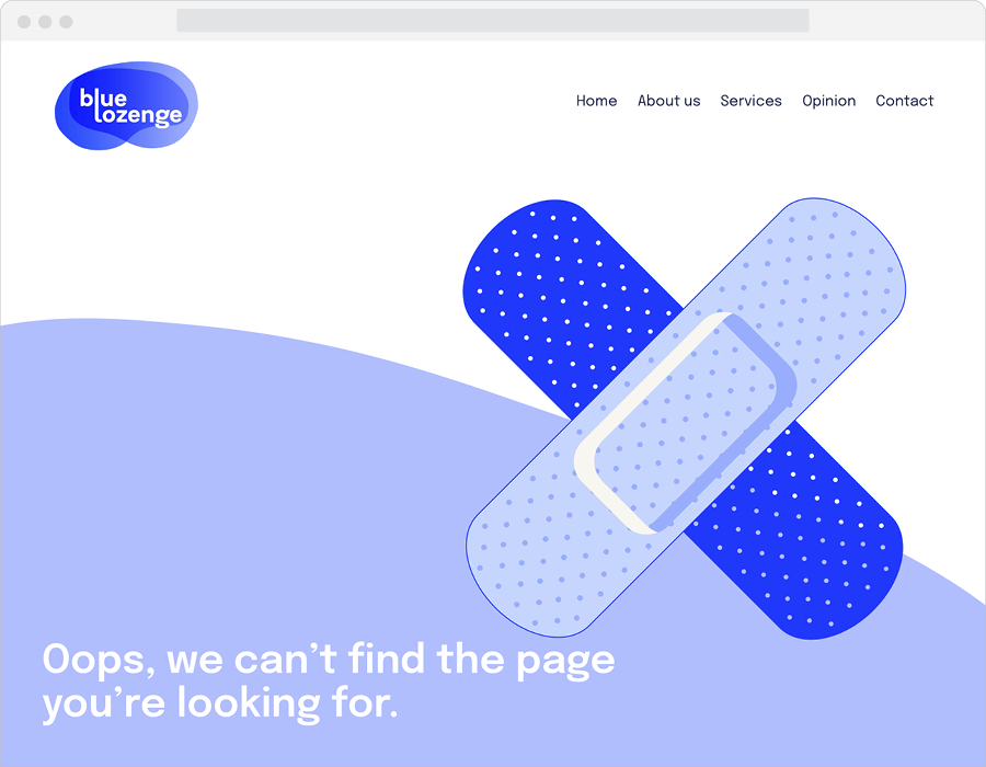
In the rare cases when a site does stop working, for instance, if a link has gone missing or a page moved,  I like to add a custom 404 Error page.

Incidentally, a 404 error (HTTP 404) relates to a code number used when the Hypertext Transfer Protocol or HTTP was developed back in 1989, and simply means a missing file.

I’ve collected together a few of the custom error pages I’ve created in the last few years, for a web designer, it’s a bit of fun. Yes, I don’t get out a lot.


Nomenclature of a URL

I was asked recently for some advice on how to migrate a domain. A migration is effectively taking all the files that display your website and moving them from one place to another. Often the reason for doing this is to move hosting providers or a transition from a development to a live phase (publishing to give it the traditional term).

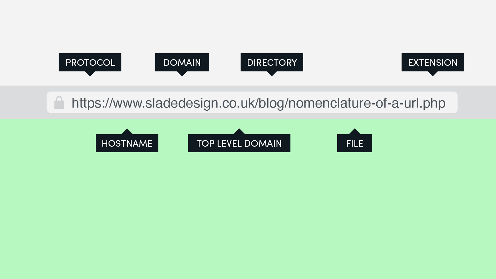
In this conversation, I was explaining the nomenclature of a URL — the different parts of the website address and what they mean or do and I thought it would be useful for other people to attempt to explain it here in case you’re looking at migrating a website. So here goes.

Protocol

The protocol is the first part of the address and defines whether your site is secure or not. http and https can both be used, however search engines such as Google will often penalise websites that don’t use the https protocol and so deny you the little padlock that appears in the browser. The worst-case scenario is that some visitors could get an unsafe message in their browser. The colon and two forward slashes are both parts of the protocol.

Hostname

The hostname is a part of the address that proceeds your domain name and is not mandatory in the browser. This means with some websites you won’t see the www bit of the address. In the early life of the internet, it was essential to tell the computer and related network what type of host you were trying to access. Now a web server, which is what this particular hostname specifies, is more common.

Domain

A domain name is the part of the address that is obviously the bit you can customise and is unique to your product, brand or organisation. No two domains (provided they use the same top-level domain) can be the same. This means it is getting harder to find domains that haven’t already been registered. According to the latest figure from last year, there are 360 million registered domains worldwide.

Top-level domain or TLD

Also known as domain extensions they are used to help define the location of a website. For instance .com historically was associated with websites registered in the US. It’s much less relevant now considering there are over 1,500 domain name extensions and you can register what you like from wherever. Essentially domain registrars are running out of unique domain names to sell, hence adding more domain extension options.

Directory

The directory is a tricky one, essentially this part of the address by definition could be a directory, folder, category, tag, slug or many other things. It depends on the technology you are using to create your website as to what this might be.

File

The file is a bit easier as it is the only part of the address that does the exciting bit for web designers — displaying the lovingly crafted website that we spend hours building.

Extension

Finally, and again not a mandatory part of the address is the file extension. Modern browsers are much cleverer at working out what to load for themselves so you won’t always see this in the address. If it is there it’s often a clue to the type of technology used to build the site. I’ve written an article called What should I use to build a website? that helps define some of these.

So next time you visit a website, once the page has loaded, look at the address or click in the bar, and see if you have some of these parts. Hopefully, you’ll understand a little more about what they do.


What should I use to build a website?

I get asked this question from time-to-time, most recently by a student studying games development. Before that, it’s been from students at Bedford College, where I’ve been lecturing in graphic design and animation.

From time-to-time, I’ve run short courses on the practical side, mainly Photoshop and After Effects as an introduction to help students showcase their work. For design students, it’s essential to be able to present and promote their work and begin to develop their own unique self-brand. Australian Graphic designer, Christopher Doyle took this to the next level with his Personal Identity Guidelines project.

Ultimately the majority of the students will get full-time jobs, but before that happens there are degrees shows, they will meet potential clients or employers and then there is the pressure to become part of the established design industry. All these people need impressing and that is usually with a website. I will admit, with degrees shows it’s all about print — standing out from the crowd in a unique and clever way.

I digress, the point of my courses was to give students the practical knowledge to help them build an online portfolio. Before they even start to design anything though it’s essential to know what choices you have to do that building.

Here is my quick ready reckoner that I produced which covers the basics types of systems, the complexity and rough cost. This is by no means an exhaustive list but it helps define what is possible for a budget and skill level.

Type Platform Complexity Domain Hosting Annual cost*
Manual Code Difficult × × From £20
Software Dreamweaver Difficult × × £250
Adobe XD Medium × × £120
Online builder Wix Easy × £90
SquareSpace Easy × £144
Cargo Collective Easy × £135
WordPress.com Easy £36
Content
Management
System (CMS)
Drupal Difficult × × From £35
Joomla Medium × × From £35
WordPress.org Easy × × From £35

Personally, if you’re interested, I build using WordPress.org. Due to my need to control every aspect of the development of a website. I’ve opted for this service as gives me ultimate control. It’s also really easy to use and this website and blog post have been created using the system.

*Annual cost is based on a basic subscription (for software) or service (hosting), which often has advertising you cannot control or disable. I would urge caution with this as advertising is often displayed from providers or in places that may conflict with your design, views or morals.

−− −−− ·−· ··· · −·−· −−− −·· ·

This week was half term and although I was working a few days I did take the day out to spend time with the family. We visited Milton Keynes Museum, a first for me and amazed by how hands-on the displays are. I especially enjoyed the section with all things related to telephony and spotted a hand out that explained Morse Code. Although it looked good I couldn’t resist making some tweaks when I got home so that the dots and dashes read in a more logical order.

PS — the post title spells out the words Morse Code.

morse code

What are the dimensions of a website?

website width

A fellow graphic designer recently asked for some advice. They wanted to know what width to design a website to then be handed to the developer to build from.

I replied with the simple answer that it’s a popularity contest, based on some technical information. So here goes my answer.

Essentially there are two types of websites — fixed width and stretched/full width (the later is often confused with responsive websites). Responsive essentially refers to the change of appearance of a website as it appears to respond differently depending on the device used.

Fixed width websites are just that — the developer has set default values for the width in pixels based on the visual. GOV.UK for instance uses a fixed width of 960 pixels for the main content.

Stretched or full width are sites that fill the browser width regardless of how you adjust your window, hence why sometimes people use the term responsive. You are simply seeing the responsive effect live as you change the browser window shape.

So based on these types what are the dimensions of a website?

There are millions of websites and there are hundreds of devices, screens and platforms. So ultimately its about which sizes are most popular.

To demonstrate this popularity using data from two million websites collect by StatCounter gives us the following winners.

Screen width
(Pixels)
Maximum screen
height (Pixels)
Desktop market share.
Dec 2018 to Dec 2019
(Percentage)
1366 768

24.19

1920

1080

19.89

1440

900

6.83

1536

864

6.09

1600

900

4.86

1280

800

3.66

1280

720

3.59

1280

1024

3.41

1024

768

3.34

1680

1050

2.53

360

640

2.05

2560

1440

1.9

1360

768

1.6

1920

1200

1.15

800

600

0.67

360

720

0.52

2048

1152

0.43

360

780

0.43

320

570

0.4

1093

615

0.35

Other Other

12.11

TypeYear

What better way to celebrate my lifelong love and affinity with typography than dedicating an entire year posting samples of my favourite fonts each Monday morning on Twitter.

I’ve always been interested in letterforms and sketches of experimental characters appear in my sketchbooks from a young age. It was’t until university that I was given the ability to express, discover and expand my knowledge with the help of my course tutor, Phil Gray — a truly dedicated follower of lettering. This dedication is clearly proven by his online cataloguing of found letterforms, currently sitting at 4,845 images on www.thevisualdictionary.net

Brutalist type

In the last few years I’ve been using various brutalist typefaces more and more in website development. Brutalist fonts are sans serif only (not twiddly ends), usually very simple geometric forms and, in my own exclusive opinion, the letter a must, I mean must, have no terminal (the bit that curls round over the top of the letter).

A slight caveat though — there’s no definitive opinion of what brutalist typefaces should be. Typeface resource icon, Jeremiah Shoaf of typewolf, can’t decide either.

TypeYear in a leap year

After defining what I loved about brutalist typefaces I started to catalogue my favourites. The most recent example is used here on my own website. The simple and beautiful Sofia Pro, designed by French typographer Olivier Gourmet in 2009 and distributed via his foundry Mostardesign.

I decided what’s the point of my catalogue if it’s not shared so that other type-nerds can enjoy it too?

With any typography sample though, you need a good sentence. I’ve always hated type samples that use a, b, c, d, e and so on, as this does’t demonstrate the typefaces characters in context. I much prefer using a piece of writing that elegantly uses sentences so you get a true feel of how the typefaces characters interact with each other.

The Chaos of English Pronunciation

For TypeYear I’ve picked a piece of work by the Dutch linguist, Gerard Nolst Trenité. In 1922 Trenité published The Chaos of English Pronunciation. A poem that contains about 800 of the most notorious irregularities of the English language and skilfully written with alternating feminine and masculine rhymes. Perfect for 53 weeks of samples. I hope you enjoy.

Top WordPress plugins

We’ve all read a ton of blogs with eye-catching titles like the top fifty WordPress plugins, the ten best WordPress themes for your website and the mind-boggling 100 Best WordPress plugins as recommended by 1stdesigner? Personally, I stopped reading after 20 plugins.

I’ll make this simpler. I’ve been building websites since 1998 — with various legacy, dead and buried systems and software and a few that survive. Xara, Adobe’s PageMill 2.0, Dreamweaver, Microsoft’s FrontPage and shamefully QuarkXpress. In the last ten year’s I’ve been using WordPress and in that time have experimented with a wide variety of plugins and have slowly found my perfect five.

Essentially these plugins cover all the key areas needed when building a website — security, customisation, protection, optimisation and speed.

Incidentally, these are all free plugins.

iThemes Security

An essential plugin that protects your WordPress install from hackers, spammers and pranksters. Used on over 900,000 sites and updated on a regular basis by the plugin developers, it protects my sites on a daily basis and occasionally when I’m bored I’ll have a read of the logs it generates to see how well it’s performing.

Simple CSS

It’s simple, and it’s for CSS. What else can I say? It’s light-weight plugin that is very stable and makes customising any website effortless. The plugin interface is white on black and with colour-coded classes and id’s you can easily spot if you’ve mistyped some styles. 90,000 people can’t be wrong.

BackWpUp

It’s a good idea to backup your websites on a weekly basis and this plugin will make that process easy. All the processes can be automated — from what is backed-up, to where and how often. Setup takes five minutes and then just leave it to do its thing. Plus the default back-up time at 4am in the morning when I’m in bed means server load is minimised. 600,000 installs — that’s a lot of time saved, by a lot of people.

Yoast

We all love Yoast. No one else can do Search Engine Optimisation better and although the interface keeps changing, new features are added or removed. Bye bye Google+, it’s reassuring to know that I don’t have to keep an eye on changes in SEO. Don’t be tempted by cheap knock-offs.

WP Fastest Cache

I’ve tried too many caching plugins over the years. Most of them break your site eventually by storing files in the wrong places or causing a higher-server load. I finally settled on this one. Don’t be put off by the plugin icon. It’s a lightweight plugin that will speed up your site instantly. All the features are listed in one place and easy to understand. What is deflating anyway? A million people can’t be wrong.

Told you it was short and simple. Good luck.


A thing used for tying or binding something tightly

Well that’s what the dictionary defines as a ligature. I know the term for a very different use and if you’ve never heard of the term before, to a type designer they are a key part of building a typeface.

When certain letters are sat next to each other they can often sit uncomfortably and overlap or merge in the wrong place. Especially with serif typefaces. A really good example of this is the f and i together, where the hook of the f clashes with the of the i, just like this:

fi ffi

Luckily type designers who respect their art create specifically designed characters for these letter pairings and those are ligatures.

Not all graphic or web designers use them and some design programmes don’t give you the option to allow the use of ligatures. Luckily the Adobe suite does.

Since 2012, after decided to go back into web designer after a break of ten years, everything with code had changed and ligatures could now be used within most browsers and with any typeface where the typographer has created them. So i’ve been using this in all my builds since then with some very elegant results.

 -moz-font-feature-settings:"liga=1, dlig=1"; 
 -moz-font-feature-settings:"liga", "dlig";
 -ms-font-feature-settings:"liga", "dlig"; 
 -o-font-feature-settings:"liga", "dlig"; 
 -webkit-font-feature-settings:"liga", "dlig"; 
 font-feature-settings:"liga", "dlig";