Opious
Redefining telecoms.
The challenge
When a new communications provider entered the telecoms market and wanted to offer a fresh, dynamic and forward-thinking approach to connectivity how did I help make sure they stood out? The challenge was to develop a brand identity that was bold and innovative.
Zeros and ones
The style of design throughout the international telecoms market can be described as safe. It is a well-established visual style that relies heavily on digitally created and manipulated imagery that represents wired and wireless connections, photographs of customers and business people using devices, and illustrations with a style that belongs in The Matrix.

Redefining telecoms
Opious wants to redefine the telecoms market by providing businesses with all their connected services through one provider. What does that mean for the customer? In simple terms, it means Opious will provide one contract, one itemised bill and one contact number, regardless of what system, technology or device the customer is using. It sounds simple but it’s not what rest of the telecoms industry is doing.

Bold and innovative
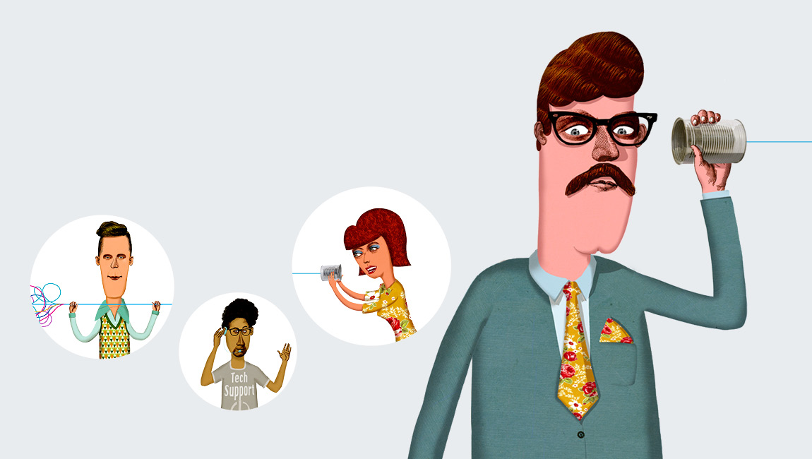
My research had revealed that telecom companies aren’t very adventurous or brave when it comes to brand imagery. So it was clear that the brand identity needed to be bold and innovative. My solution was to avoid the industry stereotypes and instead opt for an illustrative approach that was fun, innovative and quirky. I commissioned UK-based illustrator Cameron Law whose style matched this idea perfectly. I had worked with Cameron on many projects and so was able to give him a simple brief. Draw me something like Monty Python that will scare the crap out of corporations.

Frank, Max, Truman and Deta
The characters that we’re created by the illustrator quickly took on their own personas and, with a few small tweaks, were given names, roles and biographies. This was essential in developing the companies principles and tone of voice. When we employed Bedfordshire-based creative agency Oomph we briefed them to define a set of principles attributed to each character to represent honesty, simplicity, clarity, distinctive and quirky. These principles were fundamental in describing to staff and customers why Opious is different from their competitors.